
Recognition Is Bigger Than a Logo
You see a particular bottle shape, hear a few notes, or notice an unusual colour combination—and a brand comes to mind before its name appears. That is not magic. It is the result of distinctive brand assets: non-name cues that buyers learn to associate with a brand.
These cues can include packaging, typography, characters, slogans, sounds, patterns, and the design of the product itself. A logo is one asset in that system, not the whole system.
Distinctive Means Recognizable and Ownable
An asset is useful when people connect it to the correct brand and do not confuse it with competitors. Researchers often describe these qualities as fame and uniqueness.
This distinction matters because consistency alone is not enough. If every company in a category uses the same blue gradient, repeated use may make the design familiar without making any one brand easier to identify.
Products and Shapes Often Do More Than Colour Alone
Ipsos and Jones Knowles Ritchie tested logos, slogans, mascots, colours, and product assets with more than 26,000 people worldwide. Only 15% of the assets reached their highest distinctiveness standard. Product assets performed best: 31% achieved the top rating, compared with 19% of logos and only 4% of colours.
A 2026 study covering 1,162 assets across 21 categories, four countries, and nine years reached a similar conclusion: shape-based assets, including packaging, were the strongest group, while colour assets were the weakest. A colour can still be valuable, but usually works better as part of a broader, distinctive system.
What These Assets Look Like in Practice
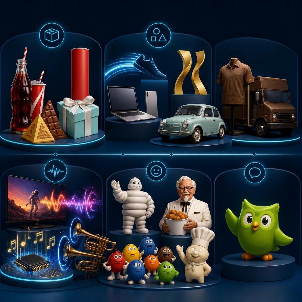
- Packaging: Coca-Cola’s contour bottle, Toblerone’s triangular pack, the Pringles tube, and Tiffany & Co.’s Tiffany Blue gift box with a white ribbon.
- Shapes: Nike’s Swoosh, McDonald’s Golden Arches, Apple’s bitten-apple silhouette, and the rounded Volkswagen Beetle.
- Colours: Tiffany Blue, Cadbury purple, UPS brown, and Barbie pink. These work because the brands repeat them as part of a larger visual system.
- Sounds: Netflix’s “ta-dum,” Intel’s five-note sound, McDonald’s “I’m Lovin’ It” melody, the 20th Century Studios fanfare, and the THX Deep Note.
- Phrases: Nike’s “Just Do It,” L’Oréal Paris’s “Because You’re Worth It,” KFC’s “Finger Lickin’ Good,” De Beers’ “A Diamond Is Forever,” and Mastercard’s “Priceless” campaign language.
- Characters: the Michelin Man, Colonel Sanders, the M&M’s characters, Ronald McDonald, the Pillsbury Doughboy, and Duolingo’s green owl.
The most recognizable brands rarely depend on only one of these. They combine several cues so the packaging, advertising, product, and customer experience all reinforce the same memory.
Repetition Builds the Association
People are not born knowing which sound, phrase, or package belongs to a company. The connection is learned through repeated, consistent exposure. Strong brands keep useful cues long enough for that learning to happen—and use them across advertising, products, websites, shops, and customer communication.
Constant redesign can interrupt that process. Before replacing a familiar element because it feels old internally, marketers should find out whether customers already recognize it.
How to Build Recognition Beyond the Logo
- Identify the colours, shapes, sounds, phrases, layouts, or product details already associated with your brand.
- Test recognition with customers rather than relying on opinions inside the company.
- Check whether competitors use similar cues.
- Build several assets that can work together instead of expecting one colour to carry the brand.
- Use the strongest assets consistently across channels and campaigns.
Measure What Happens After Recognition
Recognition is valuable when it helps the right people notice, remember, and choose the brand. Website analytics cannot prove that a particular colour caused recognition, but it can show whether branded campaigns bring visitors back, which sources produce engaged journeys, and whether returning visitors move toward enquiries, trials, or purchases.
Opentracker can help connect campaign traffic with on-site behaviour, so marketers can compare creative approaches using real visitor journeys and outcomes—not recognition in isolation.
The Logo Should Not Have to Work Alone
Brands become recognizable without a logo when they have built other cues that are both distinctive and familiar. The goal is not to hide the logo. It is to create a brand that still feels like itself when the logo is not doing all the work.
Sources
- Ipsos and Jones Knowles Ritchie, Be Distinctive. Everywhere, research involving more than 26,000 respondents globally, June 2023: https://www.ipsos.com/en-uk/be-distinctive-everywhere
- Ipsos, The Power of You: Distinctive Brand Assets, meta-analysis of more than 2,000 video advertisements, May 2020: https://www.ipsos.com/en-ch/power-you-distinctive-brand-assets
- Fiocchi, Romaniuk and Trinh, Shape-based assets are strongest: benchmarking distinctive brand asset performance across industries, International Journal of Advertising, 2026: https://www.tandfonline.com/doi/full/10.1080/02650487.2026.2637295